

A great mobile app can take months of careful planning, design and development. Yet for many potential users, the first real encounter with that product happens in just a few seconds on an App Store or Google Play listing.
Before they explore every feature, read a long description or visit the developer’s website, they see the visuals.
That makes store screenshots much more than simple screen captures. They are the presentation layer between the product a team has built and the people deciding whether it deserves their attention.
The strongest screenshot sets feel intentional from the very first image. They introduce the product quickly, communicate its value clearly and make the whole app feel polished before it has even been installed.
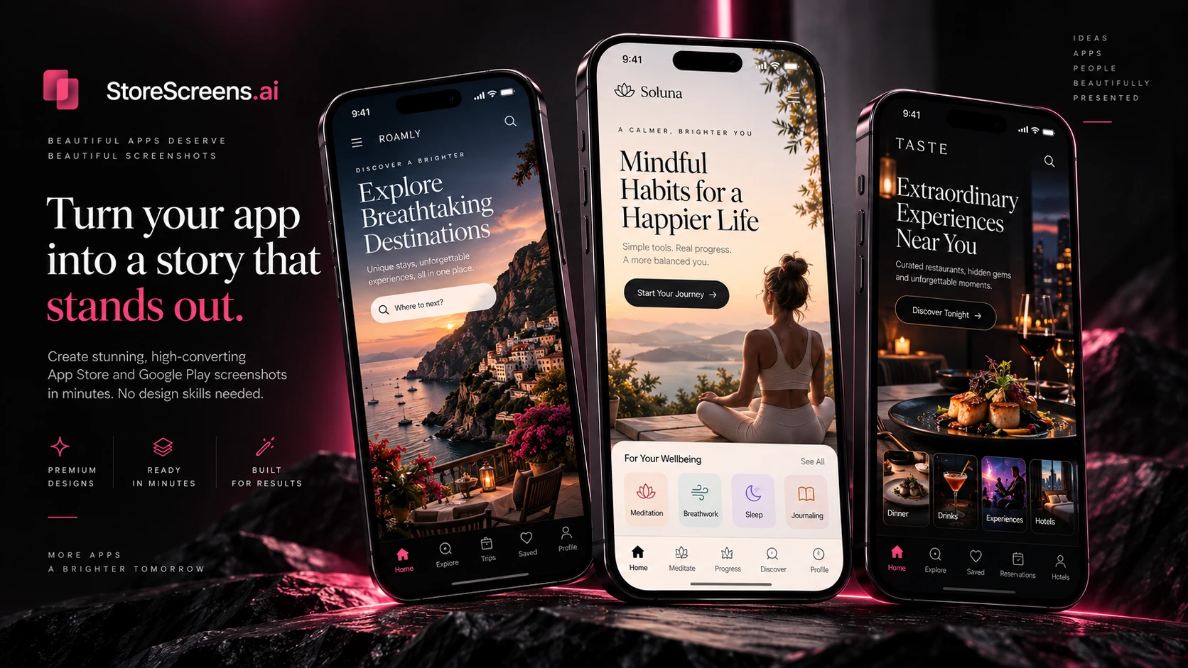
A Screenshot Should Feel Like Product Design
A raw screenshot shows what an app looks like.
A great store screenshot explains why that app matters.
That difference is important.
Instead of simply displaying menus, buttons and interface elements, a polished store presentation combines the real app experience with clear visual hierarchy, concise messaging and a layout that immediately feels intentional.
The first screenshot might introduce the app’s main promise. The next might highlight a core feature. Another can show how the product fits naturally into everyday use.
Together, those screens begin to feel less like isolated images and more like a premium visual story.
One Beautiful System Instead of Separate Screens
One of the easiest ways for a store listing to lose its premium feeling is inconsistency.
Different typography from screen to screen, changing device sizes, mismatched spacing or completely different backgrounds can make even an excellent app feel unfinished.
A stronger approach treats the entire screenshot set as one visual system.
The colors work together.
The typography feels intentional.
The phone frames remain consistent.
The messaging follows a clear sequence.
This creates the impression that the same level of attention given to the app itself has also been given to its launch.
It is also where a modern workflow can remove a surprising amount of repetitive design work.
For teams that want to transform raw product screens into a polished, coordinated store presentation, StoreScreens.ai provides a streamlined way to create premium screenshot sets for both the App Store and Google Play from one focused workflow.
Instead of approaching every asset as a separate design task, the visual story can be developed as one connected experience.
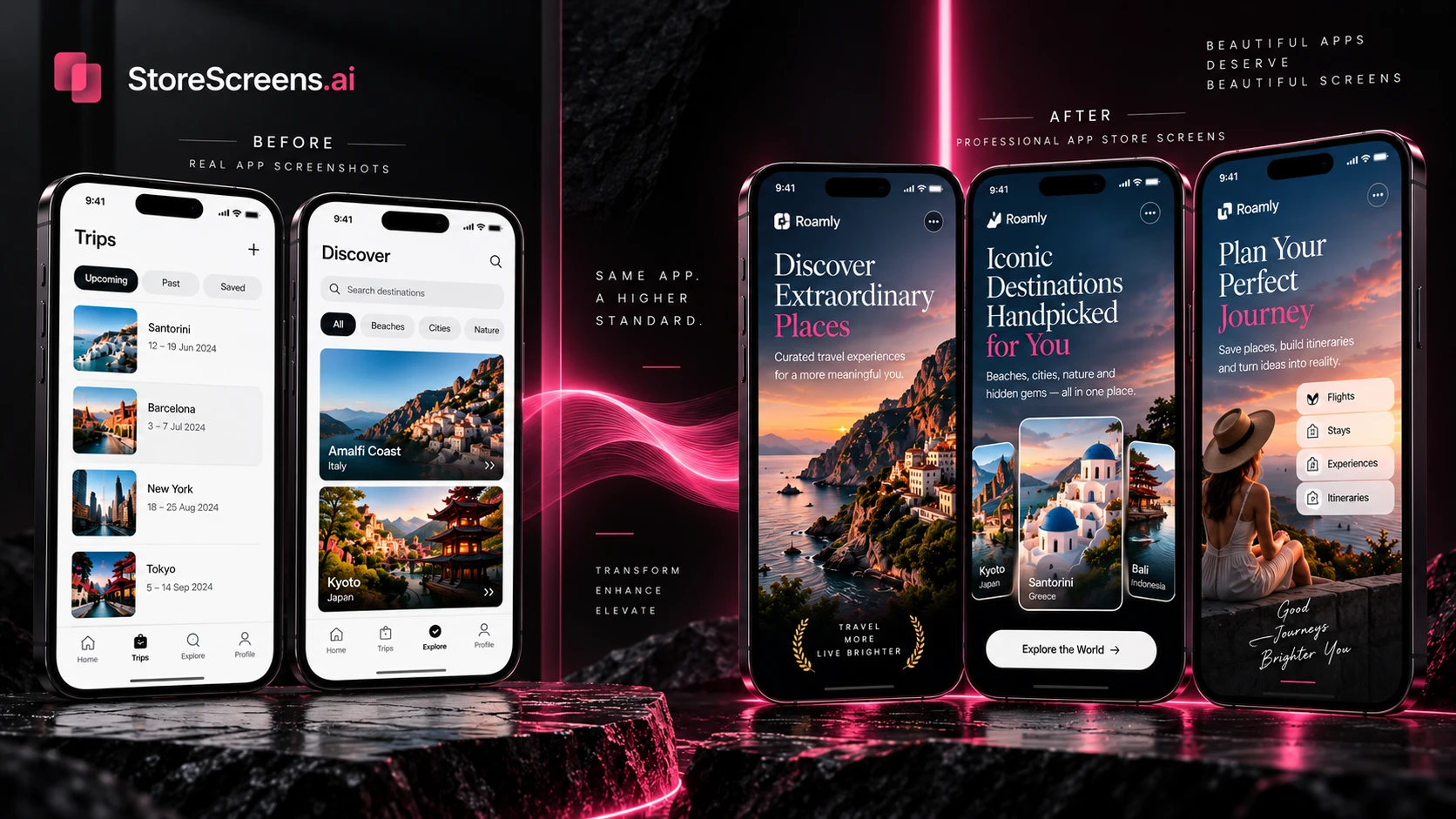
Make Every Screen Communicate One Idea
Strong screenshot design also depends on restraint.
Trying to explain an entire app inside one image usually produces the opposite result: the message becomes harder to understand.
Each screenshot should have one clear job.
A productivity app might begin with effortless planning, continue with collaboration and then show smart reminders.
A travel app could introduce discovery first, move into itinerary planning and finish with useful details for the trip itself.
Short, benefit-led headlines are especially powerful here.
“Calendar View” identifies an interface element.
“Plan Your Entire Week in Seconds” communicates what that feature actually gives the user.
The interface provides the proof.
The headline provides the meaning.
Build for App Store and Google Play Without Losing the Look
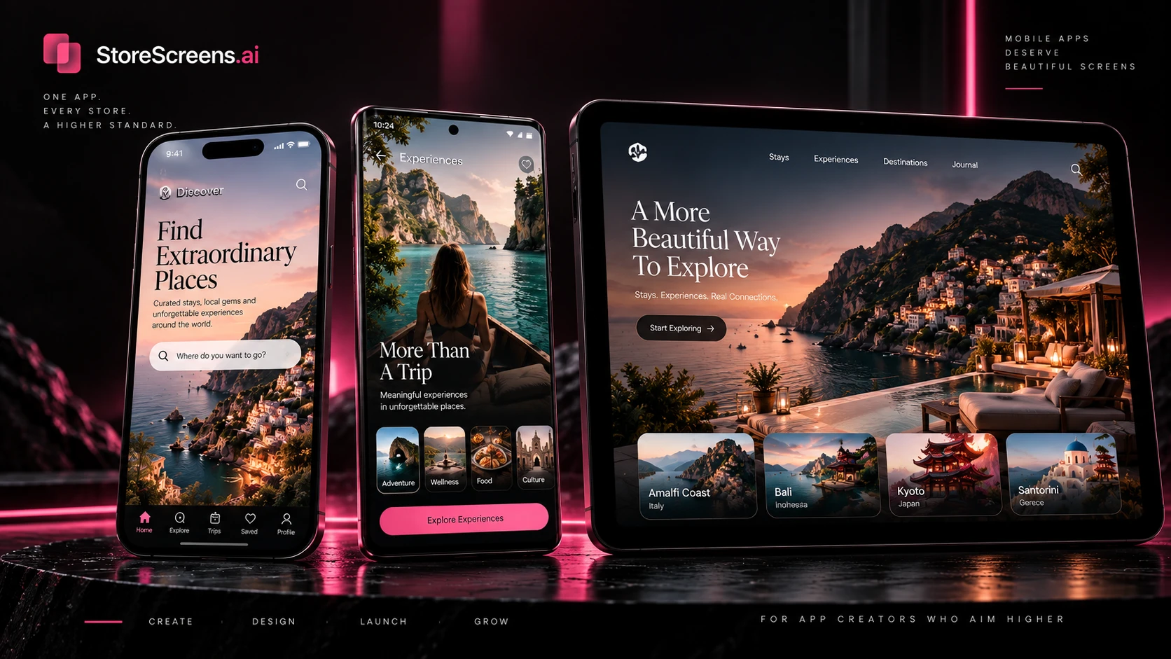
The same visual identity should be recognizable across platforms, but that does not mean every image should simply be stretched into another dimension.
Different devices and store formats require different compositions.
Text may need to move.
Device framing may change.
Spacing might need to breathe differently.
The hero element may need another crop.
The goal is to preserve the visual identity while ensuring every exported asset still looks purpose-built for its destination.
A clean workflow makes that far easier than repeatedly rebuilding each piece from scratch.
Premium Does Not Mean Complicated
Some of the most effective mobile visuals are also the cleanest.
Strong typography.
A beautiful product screen.
A focused headline.
Confident spacing.
A consistent visual language.
Those elements can communicate more than an overcrowded design filled with badges, icons and competing messages.
A polished listing should feel effortless to understand.
That feeling is especially valuable for modern apps competing in crowded categories, because the visual quality of the listing becomes part of the perceived quality of the product itself.
Turn the Listing Into a Short Visual Journey
Think of the screenshot carousel as a sequence rather than a gallery.
Screen one introduces the promise.
Screen two shows the first important benefit.
Screens three and four deepen the story.
Later screens can reveal secondary capabilities, different use cases or another part of the experience.
A visitor who only looks at the first few screens should already understand the product. Someone who continues scrolling should be rewarded with more detail rather than seeing the same message repeated.
This is where thoughtful screenshot creation becomes part design, part communication and part product storytelling.
A Better Finish for a Great App
A mobile product deserves a store presence that reflects the work behind it.
Store screenshots are one of the rare places where product design, branding and first-impression marketing meet in the same few images.
Treating them as a connected visual system creates a cleaner launch, a stronger presentation and a much easier experience for potential users trying to understand the product quickly.
The best result is not simply a collection of beautiful screenshots.
It is a visual story that makes the app feel complete before the first download even begins.